
Quiet Luxury Through Layered Light
Today we explore lighting layers to achieve an understated, upscale ambience, revealing how ambient, task, and accent illumination collaborate to calm visual noise, flatter materials, and support daily rituals. You will learn practical ratios, color temperature choices, dimming curves, and placement habits drawn from real homes and hospitality suites. Start small, test scenes, and share your questions with us; subscribe for deeper guides, product checklists, and expert Q&As to refine your next room confidently and beautifully.
Start with Atmosphere, Not Hardware
Before hunting fixtures, picture the room’s desired calm: surfaces, reflectance, textures, and sightlines that deserve to glow softly rather than shout. Work backward from feelings to functions, assigning light only where it nurtures activity and mood. Sketch circuits, anticipate shadows, and budget lumens like a minimalist. Restraint becomes luxury when every beam has intention, and every dimmer preserves options for quiet evenings and lively gatherings.
Ambient: The Quiet Backdrop
Think of ambient light as air for the eyes, a gentle envelope that removes harsh contrast while keeping shapes honest. Use uplighting, cove washes, and shaded sources to float illumination from edges, letting ceilings breathe. Avoid uniform brightness; subtle gradients invite depth, soften corners, and make textures read as rich rather than busy.
Task: Clarity Without Glare
Place focused beams only where hands, eyes, and tools meet: counters, desks, vanities, bedside pages. Shield sources, lower intensity through dimming, and choose narrower optics to prevent spill. Pair warmer ambient with slightly brighter, neutral task light to increase perceived clarity without aggression, preserving serenity while enabling precision and comfort.
Proportions That Whisper, Not Shout
Balance is mathematic and emotional. Start with a broad target—roughly sixty to seventy percent ambient, twenty to thirty percent task, and the remainder accent—then tune by room size, reflectance, and lifestyle. Layer dimmers per circuit, not per room, and commit to testing scenes at night and day. The aim is effortless comfort that feels inevitable rather than staged.


Color, Dimming, and the Feel of Time
Color temperature and dimming curves influence psychology as much as visibility. Warmer backgrounds, around 2700–3000K, suggest intimacy and hospitality, while neutral task light preserves accuracy. Pair high CRI or TM-30 fidelity with smooth, flicker-free dimming so fabrics and skin read kindly. Create morning, afternoon, and evening scenes that evolve gently, echoing daylight without theatrical gimmicks.

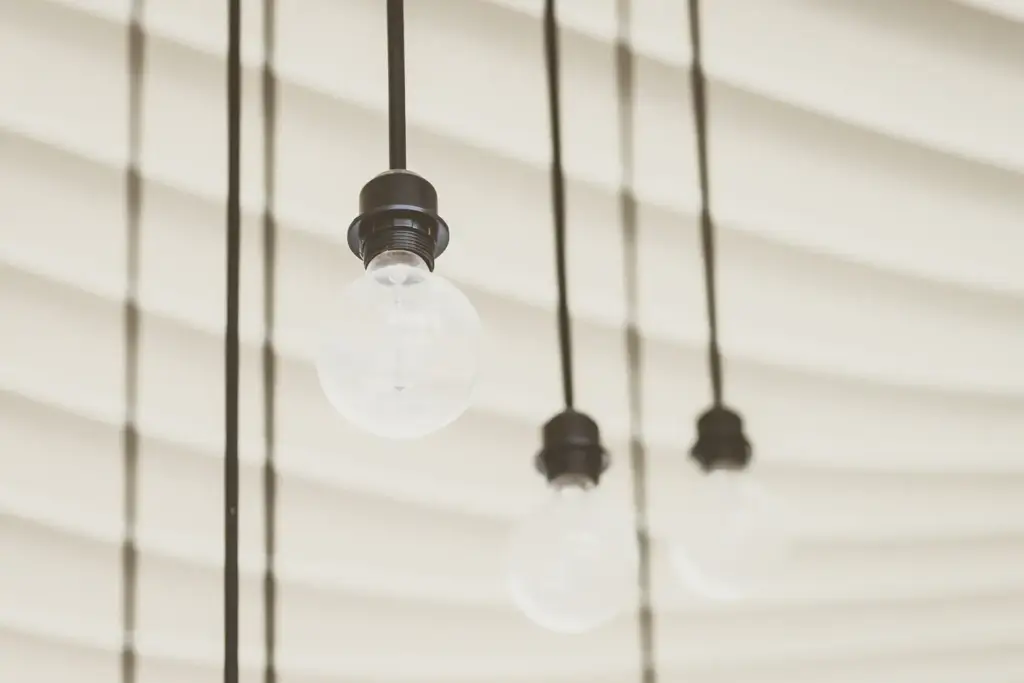
Placement, Optics, and Material Dialogue
Where light originates matters less than how it kisses surfaces. Bounce off pale ceilings, graze textured plaster, shield downlights, and angle art spots thoughtfully. Use beam spreads and mounting heights that match proportions. Remember the camera rule: fixtures should rarely be the subject; the room’s forms, finishes, and faces deserve the attention, while sources remain almost invisible.
The Power of Restraint
Upscale does not mean opulent quantity; it means selective quality and calm. Edit the fixture list, prefer fewer families, and keep finishes consistent. Accept pockets of shadow where they add relief. When the eye rests, materials sing. Quiet confidence emerges from choices that feel inevitable, supported by control scenes you can recall without thinking.

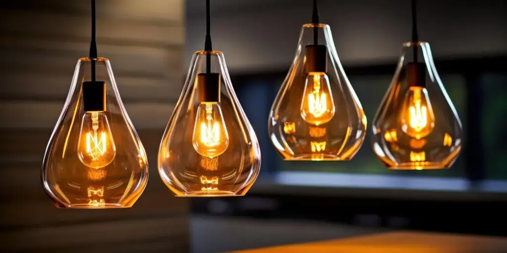
A Minimal Palette of Forms
Choose one sconce language, one recessed family, and a restrained pendant silhouette rather than collecting novelties. Cohesion reads as intention, and intention reads as quality. Complement with subtle metal tones and textiles that respond beautifully. This editorial approach lets light, not logos, carry the luxury, creating spaces that feel timeless, intelligent, and deeply comfortable.
Let Darkness Do Some Work
Edges softened by shadow appear farther away, opening rooms visually without adding square footage. Dim peripheral zones while keeping conversation islands gently lit. This contrast carves intimacy, hides clutter, and flatters architecture. Embrace the poetic moments when polished stone, glass, or foliage quietly spark against a deeper field, suggesting depth that whispers rather than declares.
From Harsh Overhead to Whispered Glow: A Story
A client with a beautiful apartment felt strangely restless every evening. One bright ceiling fixture flattened everything, from artwork to conversation. We layered ambient from coves, added task pendants at the island, and introduced two art accents. Dimming controls enabled dinner, reading, and movie scenes. Weeks later, they reported slower evenings, warmer hospitality, and deeper sleep.

Before: Fatigue and Flattened Textures
The space measured bright on paper, yet eyes strained, skin looked pale, and meals felt cafeteria-like. Reflective marble amplified glare while bookshelves sat in gloom. The single circuit eliminated nuance. Guests gathered only in the kitchen corners, avoiding the central table that should have been heart, proving brightness alone cannot promise comfort, intimacy, or grace.
Interventions: Layered Moves With Restraint
We installed a shallow cove to lift the ceiling softly, replaced the ceiling blob with two discreet downlights on a wide beam, and suspended dimmable glass pendants over the island. A picture light rendered brushwork beautifully. Scenes were pre-set for supper, cleanup, and a quiet nightcap, allowing fluid shifts without fidgeting, and inviting longer, kinder conversations.